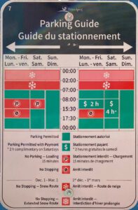
We don’t often think about how much design contributes to every day life, making it simpler or more confusing. Once in a while though, something jumps out at you. For example, a discussion arose this weekend on Twitter about the City of Winnipeg’s new parking signs, and there were few positive things said about them. Some sympathy was expressed for the poor designer who drew the assignment, since there’s a lot of information to convey here: too much, in fact.
Not everyone could tell at first that there were two sets of rules, one for each side of the sign. Since there are English and French versions of the sign’s legend at the bottom, some took it to mean that the French version of the sign actually had different rules.
There are several things going on here, not least among them the fact that the sign contains extraneous information and that it has (and apparently needs) a legend. The parking rules may be a little confusing, and the sign doesn’t make them any less so. How long would you have to stop and read the sign to learn you weren’t allowed to stop there?
A little exercise comes when we attempt to use good design to simplify the explanation of the rules. To get there, let’s apply a few basic principles.
Most important information first.
The most important information the sign contains is when you’re not allowed to stop, so that much needs to be absorbed first, and most quickly. (Compare where it is on the actual sign.) The next most important parts are the time frames, so we generally want to place the most common ones first. On the sign they’re chronological, which you’d think makes sense, but it actually obscures things a little.
For this sign, the first piece of information we need to put at the top of the sign is essentially, no stopping during afternoon rush hour. If it’s between those hours on weekday, drivers need to absorb the information quickly and move on without stopping. Next is the no parking information, which a driver should be able to absorb quickly, but if they have to stop and read it, hopefully they at least haven’t been entrapped to stop and do so when they aren’t allowed. The snow route information is important for only 2 hours per day, in the wee hours, and for only 5 months of the year. The length of time and whether or not the parking is free is the last piece of information they need, after determining that they can, in fact, park now. When drivers have progressed this far, they can do their little “happy dance” over their win at finding an available parking spot!
No Extraneous Information
It seems that perfection is attained not when there is nothing more to add, but when there is nothing left to take away.
Antoine de Saint Exupéry, The Little Prince
There are some things on this sign that the driver simply doesn’t need to know, and one of them isn’t even explained in the legend, despite being the very first piece of information indicated. The sign shows times for “No Stopping – Snow Route” and “No Stopping – Extended Snow Route”, but doesn’t explain the difference between the two. Functionally, for the driver, there is no difference, and speaking practically, the driver doesn’t actually need to know why they can’t stop there, just that it’s not allowed. (The no-stopping rule isn’t there to be followed if the explanation makes sense to the driver, it’s just there to be followed.) The “why” is extraneous information for the sign. It’s not inherently bad to tell the driver why, but with a lot of actually-relevant information to convey, it becomes clutter for the sign’s main purpose.
Along these lines, the sign should not show information for more than one parking area, since half of the information on the sign automatically becomes extraneous to the reader.
Reorganized Information
Here it is with nothing extra, in order of importance. This reconfiguration puts the unmetered parking at the bottom because it applies at all other times, becoming the default when none of the other conditions apply. For added clarity, commonly-understood icons now can be added without resorting to a legend to explain them. When you just read the items, you can pretty much see the symbols in your mind’s eye, right? The “P” with the green circle, the stop sign with the red circle and line through it?
| Mon-Fri 15:30-17:30 No Stopping |
| Mon-Sat 08:-15:30 No Parking |
| Dec-April 0:00-02:00 No Stopping |
| Unmetered Parking All Other Times |
| Mon-Fri 15:30-17:30 No Stopping |
| Mon-Fri 08:-15:30 Metered Parking 2-Hour Maximum |
| Saturday 08:00-17:30 Metered Parking 4-Hour Maximum |
| Dec-April 0:00-02:00 No Stopping |
| Unmetered Parking All Other Times |
Reorganized in this way, we can easily see that the sign on the left conveys only four pieces of information, and on the right only five. When you combine them onto one sign, you’re indicating 9 pieces of information, though the actual sign conveys at least 11. (If you add the legend, it only gets worse.) The kicker is that only one of these pieces of information is ever relevant at any given point in time, but to work that out from the actual sign requires that you comprehend almost all of them before determining which bit matters right now. On the other hand, as revised here, once you find the one bit that applies to you in the moment among only 4 or 5 items, you’re done.
Notice we’ve also moved to a simple list format. The actual sign is a chart with an X and a Y axis. Charts are better left for data, which they’re designed for. It could perhaps work beside a parking meter that you’d walk up to, but never on a street sign.
As an aside, I’m sure someone may point out that the actual rule is that the parking is never really unmetered, it’s just free with a 2-hour or 4-hour time limit. This may be the case, and it’s an easy adjustment to the information as I’ve organized it, but it’s not what the new sign says.
Bad Design is All Around
Lest anyone think I’m picking on the City of Winnipeg here, I’m not. I don’t know what the designer was given as a creative brief, which may not have given him the necessary latitude they needed to make this work. And to be fair, there are times when the style of sign presented here might be appropriate, such as interpretive signs or directional signs on a walking trail. A street sign should never have nor need a legend – those should be reserved for maps or other information that the reader may want to study.
There are a number of places where the design complicates the function it’s supposed to simplify. One instance is something you’ve seen everywhere, and perhaps multiple times per day. You may not have thought about it in the past, but you might not be able to unsee it after this:


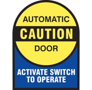
To this day, nobody has yet been able to justify to me why “Activate Switch to Operate” is any more clearly explanatory than “Push Button to Open Door”. At least the second sign – while it might leave you wondering what an “Automatic Caution Door” is – properly indicates that it’s the door you’re attempting to “operate” and not a wheelchair. Bad design is truly all around us. “Activate switch to operate” is a phrase that pretty much only comes from overthinking it. I wonder if that’s what happened with the new parking signs.


