Legal & Practical Reasons to Build Better
Within the web development industry, usability has been the subject of evolving best practices since the 1990s. Online old-timers will remember usability guru Jakob Nielssen as an early promoter of UI/UX standards which, while not specifically accessibility-oriented, have formed the basis for much of the best-practices in UI design that we know today. Usability has evolved since then to include accessibility. Websites need to be not just easy to use, they need to be easy for everyone to use. That’s accessibility, in a nutshell.
According to Statistics Canada, 27% of Canadians aged 15 and over (8 million of us) have some form of disability as a limiting factor in their daily lives. (2022 data). That’s up 5% from 2017, a reflection of the increased rate of mental health-related disabilities and the impact of an aging population.
Websites need to be not just easy to use, they need to be easy for everyone to use. That’s accessibility, in a nutshell.
Little wonder that we’ve seen increasing awareness of the impact of various disabilities and a shared determination to limit the barriers they present to people’s everyday lives, even enacting laws to ensure that we’re striving for minimum accessibility standards in various available forms, from wheelchair ramps to automatic doors and closed captions and subtitles to plain-language or symbolic signage. We’re seeing this online as well.
The first formal Web Content Accessibility Guideline (WCAG) was published back in 1999 by the Word Wide Web Consortium (W3C)1. WCAG 2.1 was a milestone release in 2018, with the latest 2.2 update being issued in October 2023. A multi-year project is underway to produce a WCAG 3.0 standard, but is expected to remain in draft form only for a several years before reaching an official release version. WCAG standards establish three compliance levels, A, AA, and AAA, with AAA being the most stringent, to the extent that it is knowingly not achievable in all contexts. WCAG 2.1 AA or 2.2 AA on the other hand, can be met with less effort than you might expect.
While the W3C cannot enforce its recommendations, the WCAG standards themselves are referenced in the laws of many jurisdictions. As of March 2024, the Americans with Disabilities Act (ADA) stipulates WCAG 2.1 AA as its technical standard for online content and mobile applications. (You’ll also see references to “Section 508” in American web accessibility guidelines, based on the US Government’s internal requirements.)
In Canada, the Accessible Canada Act (An Act to Ensure a Barrier Free Canada) received Royal Assent in 2019 and requires meeting WCAG 2.0 AA standards for specific organizations and business sectors.2 Most of these acts deal with accessibility in a broader but comprehensive way, with a section applying specifically to the web. The Canadian legislation stipulates WCAG 2.0 for specific types of organizations and sectors, leaving fairly broad exceptions. Provincial legislation has begun filling this gap by requiring private businesses to meet minimum accessibility requirements online and in mobile applications.
In 2022, Manitoba became the second province (after Ontario) to pass web accessibility legislation requiring all public sector organizations, libraries, and educational institutions in Manitoba to meet the WCAG 2.1 AA standards as of May 1, 2024, and that all businesses and non-profit organizations meet this criteria by May 1, 2025. Nova Scotia, Newfoundland and British Columbia have since adopted similar legislation, with the potential for fines levied against businesses who fail to comply. Fines vary by jurisdiction of course, with maximums in different legislation ranging from $50,000 to 250,000. We won’t be surprised to see the remaining provinces follow suit over time. Back in Manitoba, the website for the Manitoba Accessibility Office offers a wealth of information and resources.
What Does this Mean for Your Website?
It’s not all bad. Setting aside the argument that it’s the right thing to do, accessible websites are able to reach a wider audience, are easier to use even for fully-abled people, and perform better for search engine optimization (SEO). The same tactics used to make sites friendly to screen readers also help make them friendly to search engines, helping them be indexed properly. From a marketing standpoint, accessibility is good business.
It’s a safe bet you’ll need to address accessibility on your website rather than hope for an exemption.
Using Manitoba’s legislation as an example, businesses who are unable to fully comply because the technology is unavailable or cost-prohibitive can be exempted. This is unlikely to apply to many websites, since for the vast majority, a lot that can be done to comply without breaking the bank, so it’s a safe bet you’ll need to address accessibility rather than hope for an exemption. Manitoba businesses have just under eight months to get there, and should be planning now.
For the past 15 years or more, we’ve had tools available to build websites that facilitate making some of these changes globally or programmatically to minimize the effort required. Provided a website was constructed with these practices, it may not take much to nudge it into the compliance range. Older sites or ones built without some of these practices may take more work to meet the necessary standard. The tools we use at Modern Earth for building websites give us a leg up establishing accessibility by inserting most of the hidden tags or attributes we need programmatically, but there are design and development considerations during the design and build process as well, and this is where we’re seeing the most need for site updates to meet WCAG standards.
While the legal requirement may be WCAG 2.0 or 21. AA, it makes sense to set your sights on 2.2 AA, with aspects of the AAA standard included. One of the primary updates in version 2.2 is with respect to elements that can have a “focus” state, such as currently-active form elements. 2.2 also stipulates a minimum of 24 pixels for click or tap targets, and both should be relatively easy to achieve. If a further motivational bonus is needed, Google algorithms are known to consider things like tap targets on mobile devices when grading a website’s usability in ranking the site for its search results.
In some cases, applying the stricter AAA standard to certain criteria is good practice and is an easy win. For example, the contrast ratio between text in a paragraph and its background should at meet the higher AAA standard because it’s a critical factor in site usability while not being difficult to achieve. Meeting the AAA standard here makes it easier for all users to absorb your message.
What do WCAG Standards Address?
Accessible websites employ both visible and hidden tactics to achieve the accessibility goal.
Consider a website with 25 or 30 options in its navigation menu – even if that number were only 6 or 7 items, if you had to listen to a screen reader list them on every page, you’d get annoyed pretty quickly. Accessible websites have a hidden option before the menu for screen readers to skip past the menu listing and jump to the actual content of the page. This is one of the requirements, and it’s a fairly simple one.
Other hidden tactics include properly entering descriptive information (“alt” tags) for images, or marking them as decorative only, and making sure that all hyperlinks have text somewhere to indicate where the link goes rather than using only an image or an icon. These and other elements of the page’s markup (html code) such as accessible form fields are typically looked after by developers and may not be apparent at all to users who don’t rely on them.
Some accessibility measures are visible, but not ones people really think about, like ensuring that colour is not solely relied upon for navigation cues — we’ve likely all seen websites where hyperlink text is not underlined and the colour doesn’t stand out well from the rest of the text, meaning we don’t realize at first that it’s even a hyperlink.
Accessible sites using audio or video include transcripts or closed captioning, a requirement that AI has made infinitely easier to attain programmatically in just the last couple of years.
16px (12pt) is the default text size for most web browsers and is the minimum that Google’s algorithm looks for when scoring pages.
Ensuring the site is fully mobile-friendly follows a similar workflow for the web developer. Using what we refer to as responsive design principles can make a website reformat itself properly for screens of various sizes while also giving them the ability for a user to zoom in to enlarge it by 200% or more — this is the WCAG standard, rather than stipulating a specific minimum size for text. Other guidelines establish a minimum text size of 16px (12pt) as a best practice, with the caveat that this may need to be adjusted for some font faces. 16px is the default text size for most web browsers and is the minimum that Google’s algorithm looks for when scoring pages.
Design Accessibility: Typography & Colour Contrast
Pages with headings and subheadings need to maintain the correct hierarchy, and have only one top-level heading. Although not strictly necessary from a WCAG standpoint, the headings should provide a visual cue for where they are in the hierarchy… usually the top level uses the largest bold font, and decreases in size for each subheading level, down to the paragraph text. This is good for screen readers, and good for SEO. Still with typography, paragraph text should have a maximum width and a minimum font size and line height not just for accessibility, but for ease of reading. After all, a paragraph exists to be read, not just as a block of mini shapes or squiggles in a design.
In the same way as legible text must follow best practices from a typographical perspective, design aesthetics must sometimes be forced to take secondary priority to accessibility. Undoubtedly, colour contrast can be one of the most difficult accessibility concerns to manage, and designers can struggle with this, particularly since the necessary contrast level can change with the size of the element, especially with text.
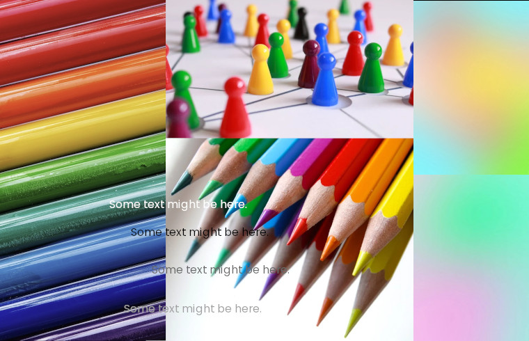
With some visual impairments, two different colours can have a similar enough value that there isn’t enough contrast to tell them apart. Desaturating an image to turn it to greyscale is one way to see how this works (at least in part), but we can also digitally approximate what it looks like to lose not the ability to see colours, but the ability to see contrast.
Without doing a deep dive into the theory of light and colour to explore the why, it can be hard to understand how exactly colour contrast works, or why two colours that seem plainly different from each other can blend together indistinguishably for some people. Those of us who grew up with black-and-white televisions are becoming fewer all the time. We do, however, have accessibility tools that simulate different visual challenges and help us understand that for someone who doesn’t fully perceive red or green, the world has a lot of brown, and pink can look very blue. On the other hand, take away blue, and yellow goes away with it. Some reds will get pretty intense, and the “bluest” thing you see may be a very green-looking version of teal.

Colour Contrast Example: Full Colour Colour Contrast Example: No Red Colour Contrast Example: No Green Colour Contrast Example: No Blue Colour Contrast Example: No Colour Colour Contrast Example: Loss of Contrast


The web still has way too much 14-pixel grey text on white pages, an artifact of a certain era of design, but for some users the text can be rendered meaningless no matter how sharp and beautiful it looked on the designer’s high-resolution double- or triple-sized computer monitor.
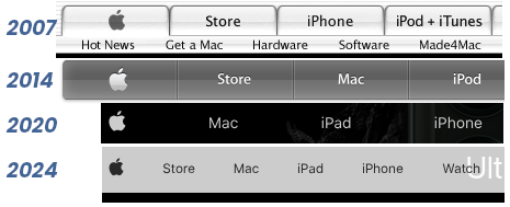
One could argue that Apple has had an outsized impact upon designer preferences. They’ve done a very good job of making the iPhone easy to use, but their website has never really met the spirit of WCAG standards, even when it manages to meet the letter of them. In 2007, the menu font was only 10px high; in 2014 the menu font was 12px with a contrast ratio of 3.24:1, which under WCAG 2.x is only suitable for text sizes of 24px or larger. As of this writing, the text size is still 12px. The WCAG standard specifies different contrast ratios for different sized text – smaller text needs more contrast to remain legible. While using a lot of greyscale and a leaning on a low-contrast look, Apple’s colour scheme typically has enough contrast for normal-sized text, but 12px is 25% smaller than the browser’s default text size.
This is where Apple may technically meet the WCAG standard, but likely falls short of meeting the spirit of it in order to preserve the design aesthetic they’ve cultivated. Most web designers simply don’t have the luxury of ignoring Google’s opinion of how accessible the website is, and those who have copied the low-contrast small-text aesthetic from Apple will need to make a change for this reason. Apple may not need to be overly concerned about what Google thinks about their website using a 12px font size, but most of us don’t have as much name recognition as Google itself.
What About Brand Colour Palettes?
WCAG offers guidelines on text contained within images, but changing your brand’s colour palette is not a requirement. That said, some of those colour palettes may be difficult to work into a fully accessible design might not be able to effectively use the colours contained in a logo. As such, the visual identity of some brands may benefit from a review of the contrast in their colour palette. In many cases, a minor tweak to a design element or a slight shift in colour hues in a logo or logotype can make it fully accessible without changing the established “look and feel” of the brand.
Bearing in mind that Manitoba businesses have until the end of April 2025 to comply, you can find a number of free and paid tools online to check your website against WCAG standards. If you’d like a review of your website for accessibility, reach out and we’d be glad to assist.
- The W3C was founded in 1994 by the inventor of the world-wide web, Tim Berners-Lee, and has become the de facto arbiter of web standards, and celebrates its 30th anniversary this year on October 1, 2024. The W3c established its Accessibility Guidelines Working Group in 1997. ↩︎
- Canada has also set a National Standard for ICT products and services, which follows the Harmonized European Standard accessibility requirements for ICT products and services (EN 301 549), from the Standards from the European Telecommunications Standards Institute (ETSI), noting the equivalence of its specific sections with WCAG 2.0 AA and 2.1 AA. ↩︎


This is fantastic article , now i am going to double check mine and recommend these to my clients – also I am going to share this on social I am assuming this is ok ?